|
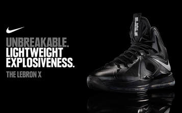
This ad was inspiring because of the simplicity of it. It looks so simple with just a shoe and regular font but there are minor details that make this stand out like the highlights on the shoe and reflection below it. It make the whole piece look very elegant
|
|
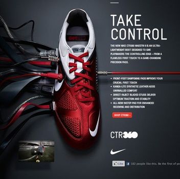
With this piece I like the way the wording it. The "Take Control" statement with the wires attached to the shoe ad an effect that makes you stop to think. It was very creative and the colours all work together very nicely. The only think I dislike is the amount of wording there is on it, I cant think of many people who would take the time to read all that. Even I haven't read all of that
|
|

|
The thing that stood out the most for me in this piece is the lighting and symmetry in this piece. Something about the shoes being perfectly align and such makes the piece very eye catching and easy to look at.
The colour of the gold on the shoes with the highlight gives them a very rich look that will bring people in, as well the granite look on the text gives almost the same effect with the highlights which i appreciate very much. |
The Ad Me and My Partner Created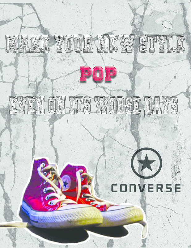
|
On our advertisement we outlined the shoes due to some issues with the background erase tool. We wanted to show the brand right away so we made it our focal point with the dark "Converse" symbol. The shoe itself was not edited very much but we did add a few Drop shadows to them along with some of the texts.
|
